 SharePoint Products
How beautiful is your intranet?
Corporate websites are meticulously designed to evoke trust, retain attention, and to be easy to use. Intranets often lag behind such attention to detail.
We provide comprehensive, SLA based support services for your intranet and other Microsoft-based applications.

We offer comprehensive Microsoft consultancy services to help organisations build out and optimise their digital workplace.
Find out more about our Microsoft 365 consultancy services![]()
Find out more![]()
Find out more![]()
Find out more![]()
Lightspeed365 intranet is a set of premium webparts that significantly improve the employee experience and branding of your SharePoint intranet
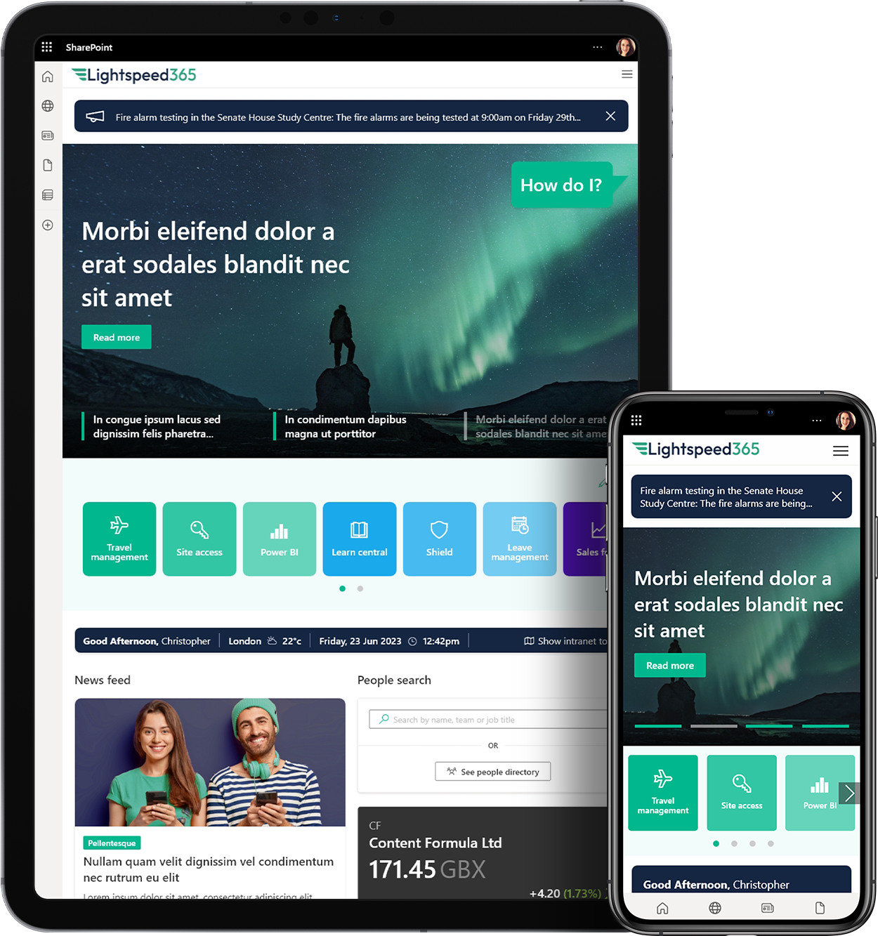
At Content Formula, we have been building SharePoint intranets since 2007 and are renowed for our award winning designs.
See SharePoint intranet![]()
Find out more![]()

Find out more![]()
We are experts in Microsoft technologies and deliver market leading consultancy and development services on: SharePoint, Microsoft 365, Teams, Power Platform and Azure.

We are a digital workplace consultancy and Microsoft Partner that specialises in delivering technology solutions and services to help people transform their digital workplace.
See SharePoint intranet design examples![]()

Microsoft Cloud
Solution Provider program

HM Government
G-Cloud
Gold Collaboration and Content
Silver Cloud Productivity
Silver Application Development