
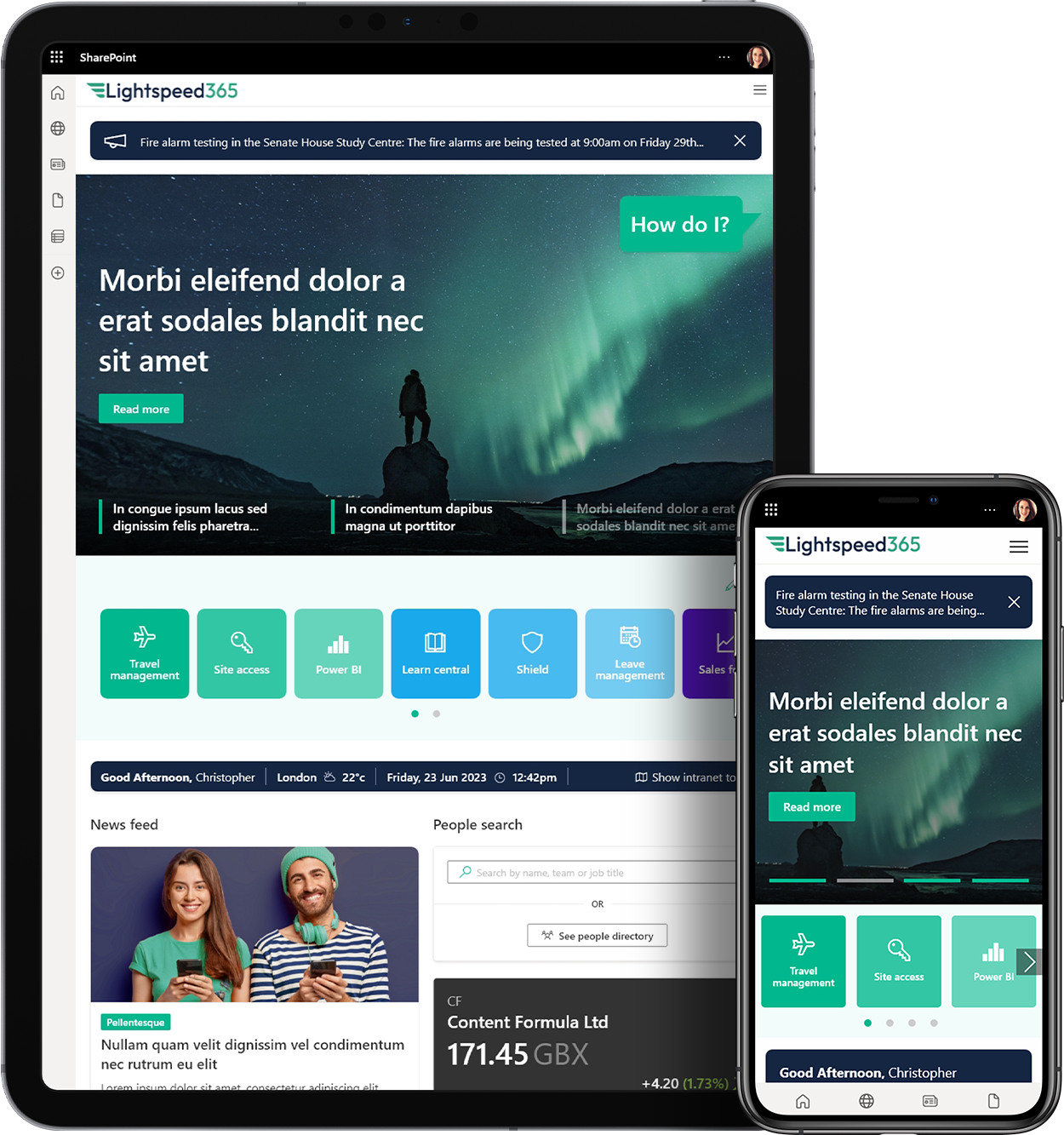

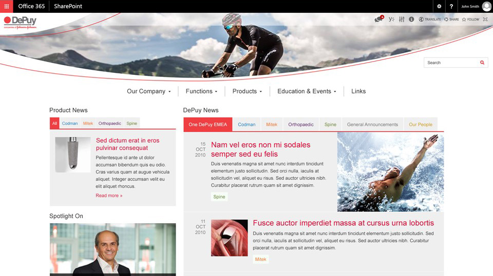
 SharePoint Products
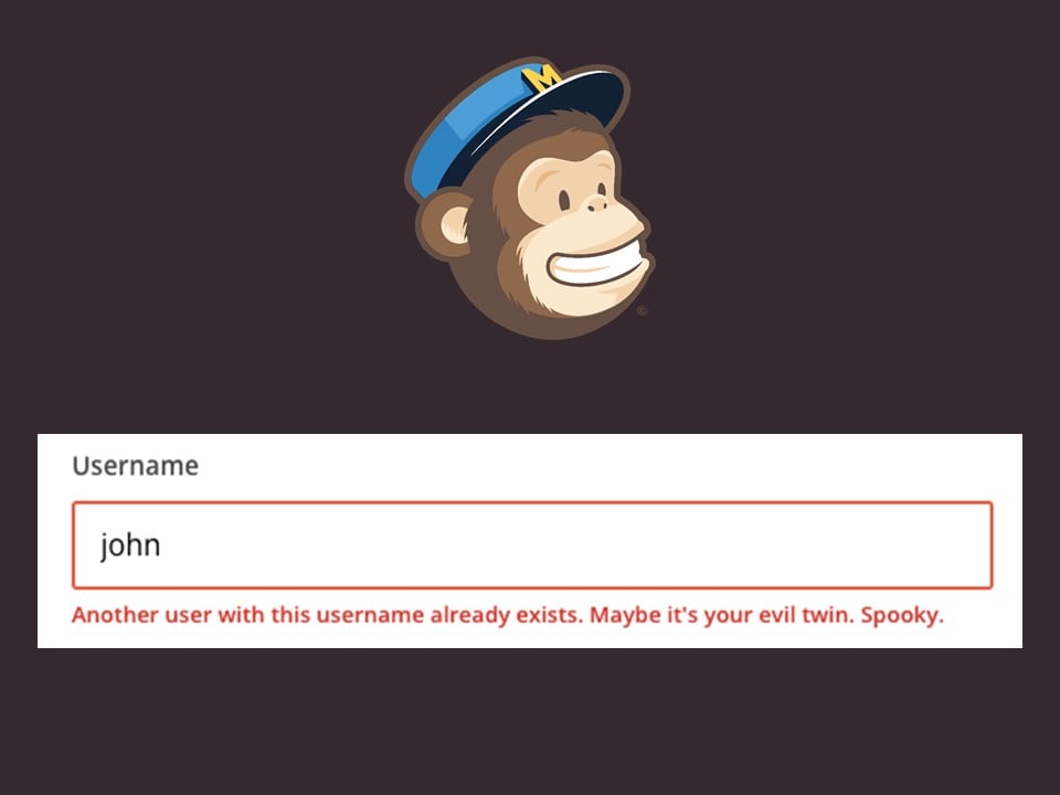
I was browsing the app store on my iPhone the other day and I came across an app called “Tornado Guard” which, apparently, alerts you when there is a tornado warning in your area.
It had an average rating of 4/5 stars based on 4 reviews.
Admittedly, there arent many tornadoes in South West London, but it was the first time Id seen an app for predicting or warning about natural disasters, so I had a look.
Here are the 4 user reviews:
5 stars. “Amazing user interface design. Lots of choices for alert tones.”
5 stars. “Runs like a dream. Very fast and no crashes.”
5 stars. “I like how you can set multiple locations.”
And finally…
1 star. “Did not warn me about tornado.”
Now, obviously this highlights a problem with average ratings, but also something else:
The initial reviews are focused on something called Surface Delight. A user experience can include elements of surface delight. These are usually local, contextual and isolated components of the overall user experience. They provide a brief sensation of delight in the user. Some examples include:
Beautiful photography or graphics used in the content of the user interface
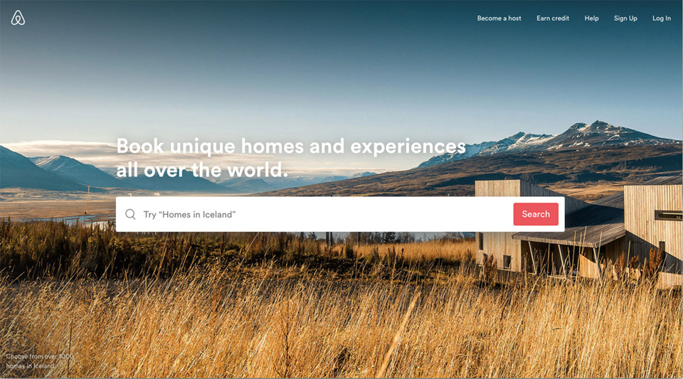
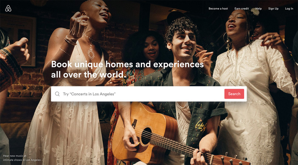
The travel website AirBnB is a great exponent of this with large enticing photos of interesting and beautiful destinations, but also people enjoying holiday experiences.
Admittedly, this is a lot harder to do on a digital workplace, unless you have a professional photographer on your team. But there are ways to borrow some inspiration from sites like AirBnB.
For this client we created an interactive header element that made use of some really nice brand imagery, but also housed a photography competition where employees who were keen amateur photographers could submit their own photos. The only constraint was that they had to embody the brand slogan Never stop moving.

Subtle animations that add an additional layer of visual clarity
Again these are used really well on some websites. For example, http://rollpark.us/. This site uses some really nice animations to explain how Rollpark works and the benefits. Some are key to the explanation like the one that shows the layers of the carpark surface and explains what they are. Others are just for decoration, but add a touch of fun to the graphics. Its all done very tastefully.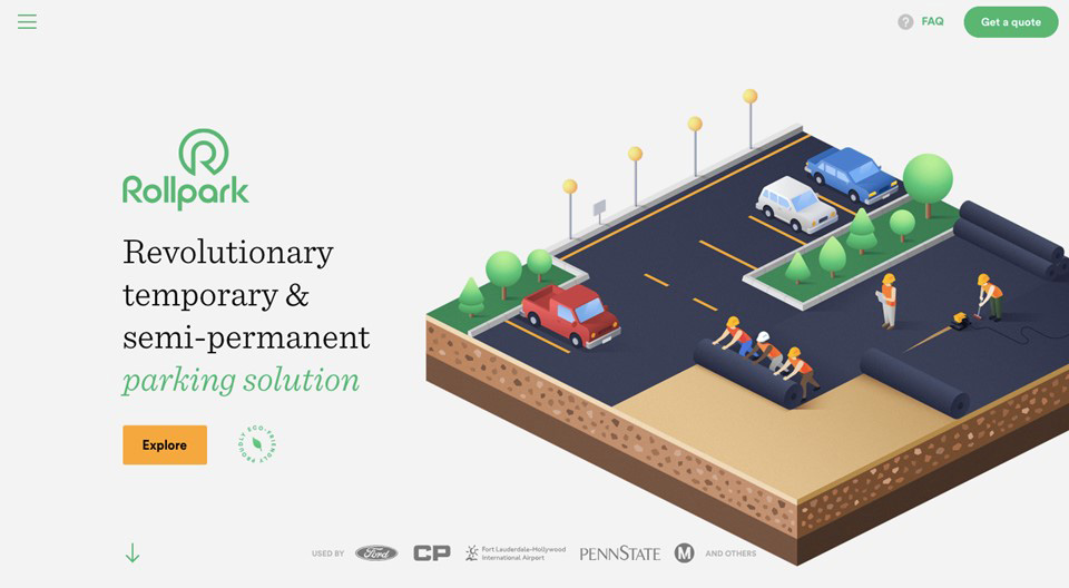
This is really much less common on intranets and its because it can feel really tacky and in bad taste if money is invested in animations when other aspects of the experience are left wanting. But, some subtle loading effects and transitions on carousels etc can add a premium feel without breaking the budget.
Heres an example of a nice scrolling animation effect we implemented on a customer intranet. This was to promote a fundraising initiative that involved a sponsored walk. The key thing is that these little embellishments dont get in the way of the user doing what they need to do and that they dont delay them in any way.
Well written micro-copy potentially with appropriate touches of humour
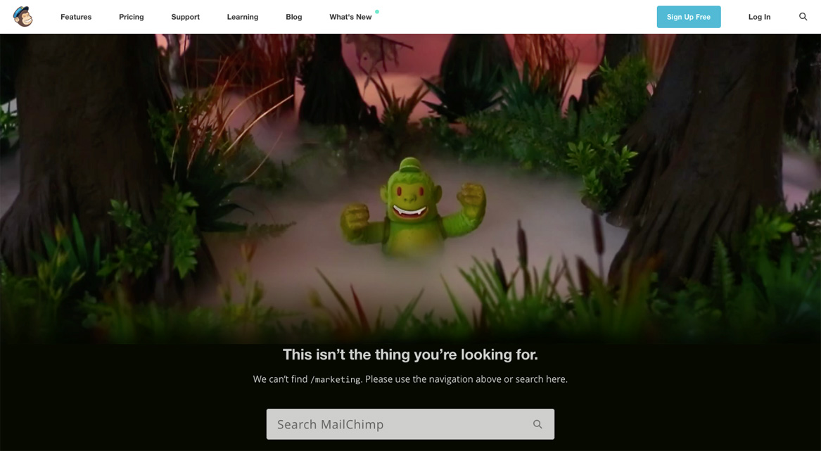
I have noticed that MailChimp do this really well. MailChimp is an email marketing tool and they have really embraced a clean UX concept, with touches of humor. This extends to the micro-copy the small bits of text that appear throughout the site, such as form validation messages, signposts etc.
If you have a talented writer, then why not add thoughtful microcopy it can really add a human touch to the digital workplace, through the use of humor and friendly non-technical language. You dont want your digital workplace microcopy to read like it was written by developers.
These types of UI elements are a bit gimmicky, but if the underlying product is excellent, then they can be the finishing touch the icing on the cake. However, if the underlying product is poor, they can feel tacky and incongruous.
Theres something that contributes much more to a truly delightful user experience than Surface Delight:
Deep Delight.
Unlike Surface Delight, which is pretty superficial stuff, Deep Delight is much more fundamental and holistic. It can really only be achieved when all or the vast majority of – user needs are being met.
What do those needs look like?
Youve probably heard of Maslows Hierarchy of Needs. Well theres one for user experience too:
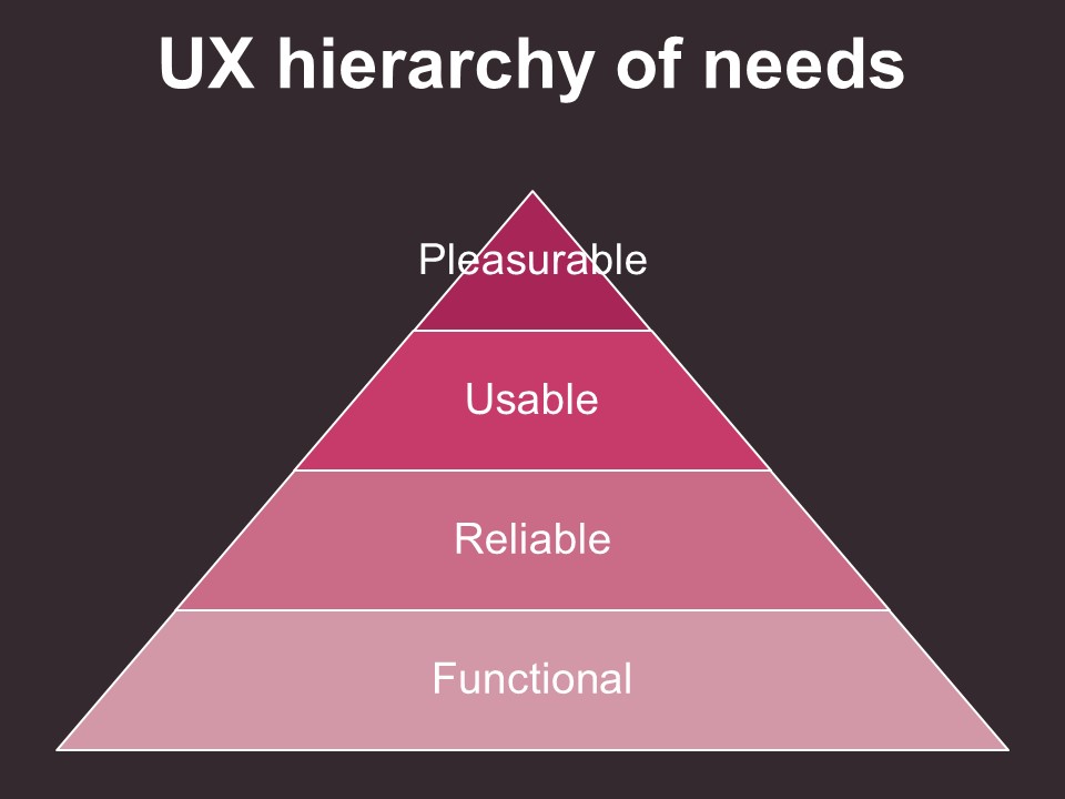
- Functional thats the base of the pyramid. The system does something that is useful to users.
- Reliable When users want to use it, its available and it doesnt crash etc
- Usable The system is easy to use
- Pleasurable Having fulfilled the bottom 3 foundational elements, the system does something extra to improve the user experience even further
Now the delightful experiences can come only when you are operating in that 4th layer (at least the more meaningful deep delight ones). Most digital workspaces today are operating in the usable layer. But, we should really aspire to more.
Were going to explore some ways to achieve delightful experiences for users. Some are about surface delight, but some are about achieving that delight at a deeper more meaningful level. For inspiration, were going to look to an unusual place… Hollywood.

1. Do thorough user research
Can you name the TV show or Movie from this screengrab?
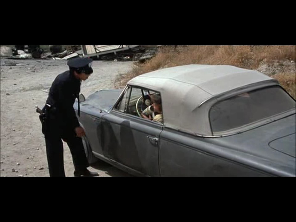
Thats right Columbo! Hes an LA cop, but he doesnt carry a gun. All he needs is a notebook.
He disarms his interviewees with his non-threatening non-judgemental demeanour. People warm to him and dont see him as a threat. But he combines perseverance and thoroughness to really get to the bottom of what happened. He is extremely curious, he leaves no stone unturned and no pertinent question un-posed. All the while remaining extremely polite and courteous towards his interviewees. He never pushes too hard, but always comes back to ask more questions if he needs to.
And thats how he solves the case he learns so much about everyone involved and their motivations as well as the events that led up to the murder. And bam the answer comes to him the hole in the story of someone becomes obvious. He knows the answer.
If he turned his hand at interviewing users, he would surely be the most informed UX practitioner around. He would know everything about what users are trying to achieve, how they work, the barriers they face and so on. And this intimate knowledge is vital in setting the right course at the very beginning of the journey to a delightful user experience.
By adopting a Columbo style approach to user research, you will be in a much stronger position initially to deliver a delightful user experience. Because you will understand your users and what they truly need perhaps better than they do themselves.
Make time to talk to a wide range of users. Dont just ask them what they want they often dont really know whats possible and feasible. Ask them about their role, who they interact with and how, processes they follow and how they access the information they need.
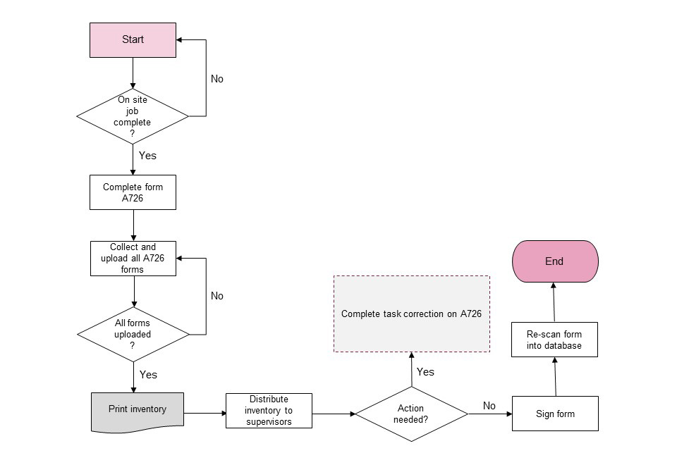
You can capture detail of processes in process flows or user journeys. Capturing this info, you can then look for opportunities to improve a single step in the process, or the whole process and youll be able to add value.
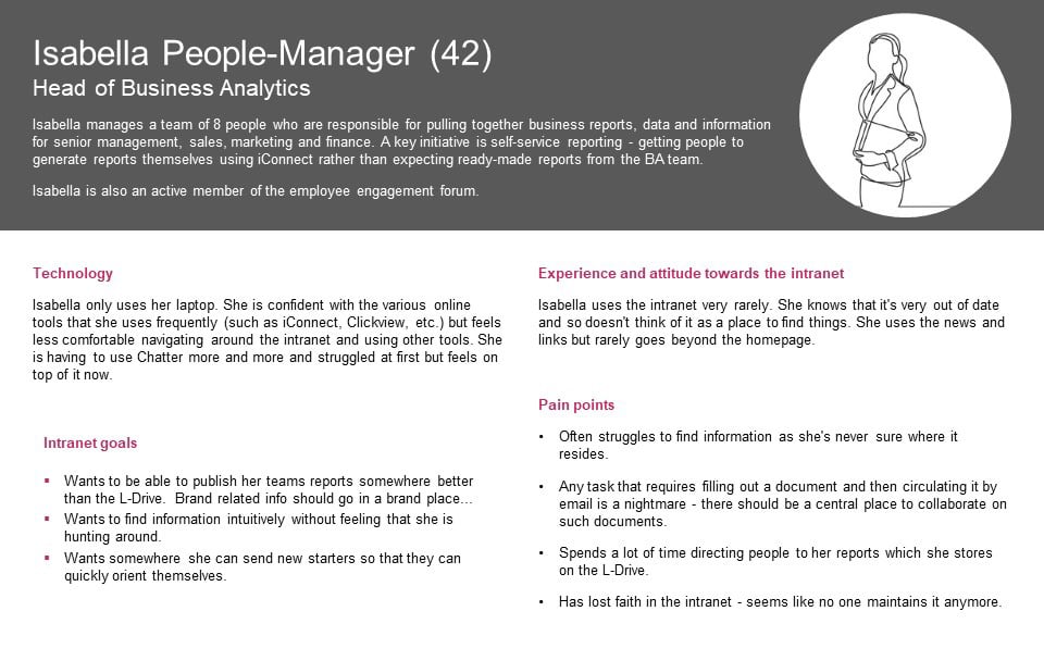
Also, having spoken to real users, you can create personas like the one below These serve as a reminder when you are designing or building out new features a reminder of who you audience is and what their needs and frustrations are.
2. Make new mistakes
Can you name this movie?
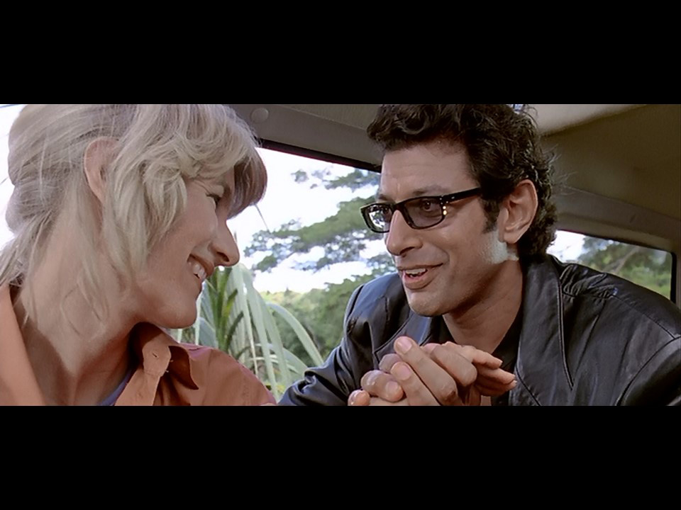
After the spectacular failure of his Jurassic Park experience, creator John Hammond went back to the drawing board.
When he told Dr. Ian Malcolm (Jeff Goldblum) about his plans for a second park he said Dont worry we wont make the same mistakes again
And Dr. Malcolm responded: No no no, youre making all new ones
Like John Hammond, you must avoid making the same mistakes again and again with the digital workplace. Here are a few common mistakes that we see organisations making over and over again:
- Not paying attention to search. Just leaving it as is and wondering why users hate it. Theres lots you can do with search if you configure it correctly. But, you also have to refine it over time review the search logs and they can tell you a lot about what people are searching for and how you can improve the experience. A really simple one that often gets overlooked is promoted results or best bets. These are manually curated search results for common search phrases. You might have noticed this, but the majority of users are terrible searchers! They often enter one really generic key phrase and expect the search engine to know exactly what they are looking for. These search experiences are exactly the kind that you can improve with carefully curated promoted results.
- Not being disciplined about governance and ongoing research and improvements. When the new digital workplace is being launched everyone has good intentions about governance and continuous improvement. But, it too often loses momentum usually when the vision holder, the driving force behind everything, leaves the business. And the digital workplace falls in to 5 yearly cycle of boom and bust. Well, this is going to sound like a sales pitch, but you should really consider having a consultancy organise and chair your governance committee. If you find one worth their salt, theyll be keen to keep the business and will be proactively driving things forward come rain or shine.
- Not giving things silly names. Its too tempting to brand everything. The policy library doesnt need to be called The BPK Bible, or whatever. Just call it something that someone who walked in the business yesterday would understand. Calling things odd names creates something we call Mystery Meat in UX navigation items that youre not sure about what is in them, and youre hesitant to try.
- Agonising over graphics or the look and feel. Dont get me wrong, I totally endorse having professional graphic design for any digital workplace, but the level of attention and budget it often gets relative to the other aspects of the experience. Its just insane. Keep it clean leave it to the professional UX designers, try not to make it your baby.
There are many areas like this where companies fall into the same traps again and again. So, be careful not to do that.
However, unlike Jurassic Park, you shouldnt worry about making all new mistakes. In fact, you should be prepared to make them continually, but have the right feedback mechanisms in place to learn and correct them quickly. This often doesnt involve scrapping an idea or part of a system, but simply shaping it in a slightly different direction. The result of doing this continually will be an evolution towards something better than what came before. And users will see continuous progress. They wont assume it will never work well, or theyll have to wait for some upgrade in 5 years time.
As Thomas Edison once said I have not failed. I have just found 10,000 ways that wont work.
3. Personalisation

Truman Burbank was the unsuspecting star of his own TV show. From the day he was born, his whole world was designed around him, and full of actors. But, at eventually he began to notice that something wasnt quite right that people always seemed to appear at the exact same time, and traffic would always materialise to block his exit from the city. When he was feeling down, his best friend would always just happen to turn up with a few beers. For Truman it became a nightmare that he must escape from.
But, this experience would be a nirvana for your users. Imagine feeling like the digital workplace was all choreographed and organised around your needs and your personal priorities.
Wizdom gives you a lot of power to tailor the experience for different users based on what they do or where they are based and so on. But, to make this personalisation and targeting work well, it requires a lot of work behind the scenes. You need to make sure your Active Directory is in good shape and has accurate information on people. And you need people who know the content to make decisions about what is relevant to whom and, even at what time. But, get it right, and it can feel really special to your users.
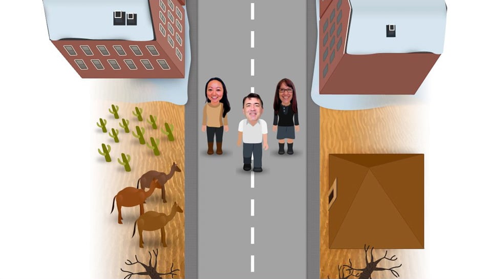
When designing a digital workplace for a UK university, we designed the navigation entirely around roles and timings. A first year student would see a set of guidance in the navigation that was specific to them during those first few weeks of study, such as how to enrol. Whereas a third year part time masters student in a different faculty would see a completely different set of guidance.
4. Why so serious?

Why so serious?
The Joker character in the Batman films and comics has always added a touch of humour despite his sinister motives and actions.
The audience can chuckle at his gags, but still see him as a serious threat.
Something that can really make a digital workplace feel more like an extension of human society is a bit of humour, especially people not taking things too seriously or even making fun of themselves.
Its interesting to employees on two levels. Firstly, people are interesting to people. When you look at analytics reports for intranets youll notice how frequently visited content is that involves people winning awards or getting promoted, and seemingly trivial stuff like photos from the annual conference. Secondly, the humour adds a level of humanity and emotional engagement.
We have run a few campaigns for companies that involved generating interest in a new initiative or in the organisations core values and so on. One of the most successful ones included an animation that kicked off a peer recognition competition. Employees were encouraged to nominate colleagues who embodied the company values in their actions. Senior leaders in the organisation agreed for their faces to appear on little characters and they even voiced the roles themselves. As you can probably imagine, the acting was of a pretty low standard but it generated real interest as it was very authentic. That campaign ended up achieving 80% participation across the whole business. Thats participation, not just reach. It reached literally everyone in the company and 80% of them actually took part by nominating someone either via video or written nomination.
Also, we had some fun on the intranet homepage on the launch day of the campaign:
Its really worth looking for opportunities like this to add emotion to your digital workplace don’t make it too clinical and humourless.
5. Shop windows?
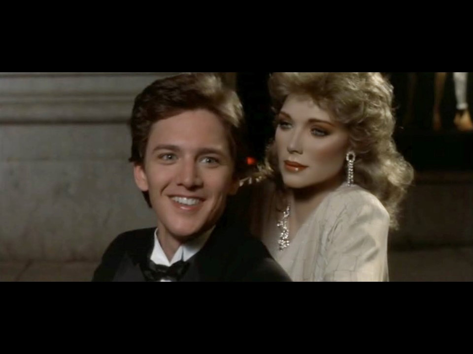
There was a movie released in the 80s called ‘Mannequin’ which was about a department store window dresser and his mannequin.
When nobody was around except for the window dresser, the mannequin would come to life and they ended up falling in love.
The mannequin was played by Kim Katrall of Sex and the City fame. Thats not her in the photo by the way.
Can you imagine the moment when she told her family she just won a part in her first Hollywood movie…
Fantastic! Oh well done! So whats the role?
A mannequin
… Great!
At least she didnt have to worry about her acting being too wooden.
But anyway, shop windows is a term we often hear in relation to sections on the intranet. That the landing page should act like a shop window.
NO the landing page shouldnt be a shop window.
Shop windows either look like this:
Or this.
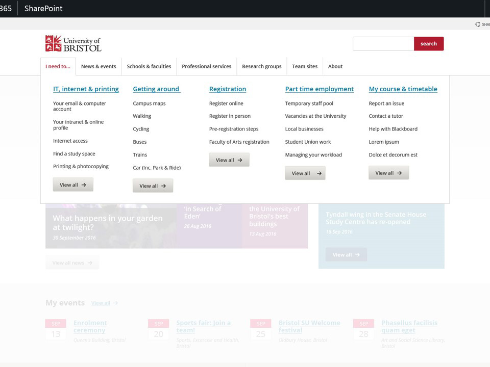
No, no, no. What users really need a section landing page to be like is a Store Directory!
The one you see on a big board once you are inside the store. This tells you everything you can expect to find in a neat and logically organised fashion.
Heres an example:
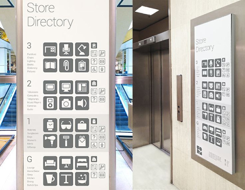
Dont let anyone tell you that it looks too text heavy theyre talking nonsense.
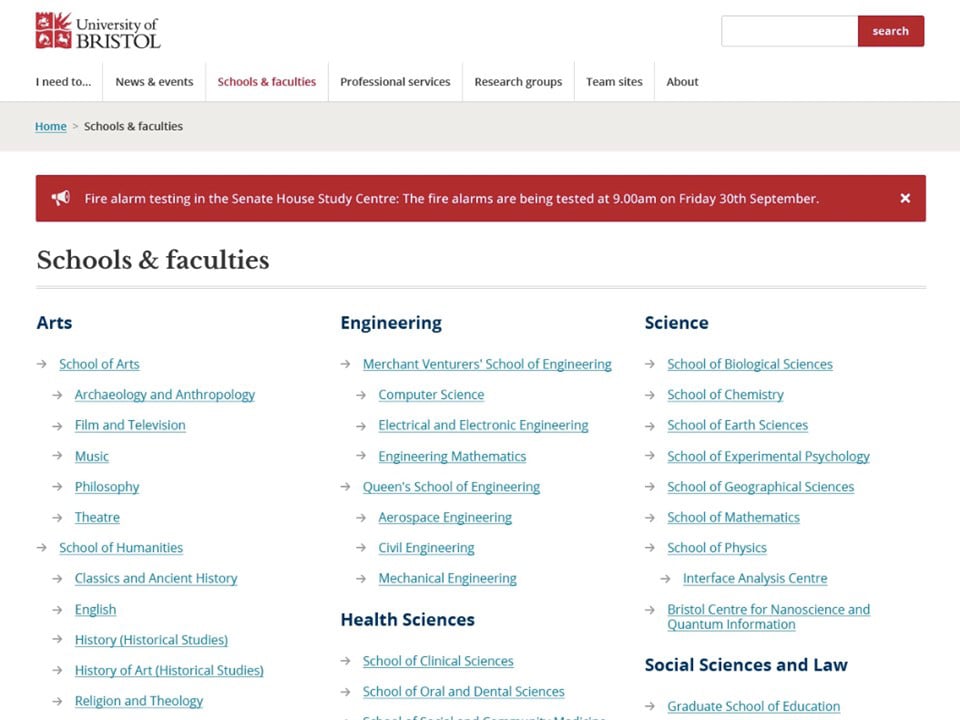
Sit and watch someone take a usability test using pages like the ones below and watch them breeze through it:
6. Greed is good
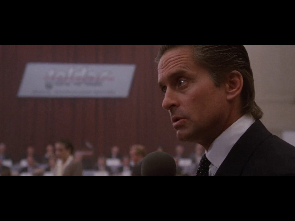
In 1985s Wall Street, Gordon Gecko addresses the stockholders of Teldar Paper after just buying a majority stake in the company. He famously states:
Greed is good. Greed is right. Greed works. Greed clarifies, cuts through, and captures the essence of the evolutionary spirit
And if youre going to deliver a delightful user experience, youd better get greedy. There are so many areas that you will need to invest time and budget. You wont achieve delightful user experience on a shoestring.
You cant just accept what you are given. Someone with no understanding of whats required or whats at stake will normally have put an arbitrary number down and that became your budget. You will need to make your case. Demonstrate return on investment.
If youve done your user research right like Columbo would then youll be aware of many processes that users are completing. You can calculate how long they take, how often they are performed and by how many people. You can then put a financial cost on the total time taken across a year.
Then you can highlight the changes you plan to make to the process, and the new time it will take (based some quick and dirty prototype testing you did). Voila! you have a monetary figure in terms of cost savings something to bolster your case.
If the process is not of interest to the intranet sponsor because its not their department, then go to the person whos department it is. Why not get a budget from every dept in the organisation?
And you need to do it regularly. Not once every 5 years. How can you evolve the digital workplace if the budget goes into hibernation for years at a time?
We have a customer that is involved in the UK property market we designed and built their digital workplace for them and help them to evolve it. Our main point of contact at that business has been very successful in getting lots of continuous investment. After the initial launch, rather than saying job done, he went to the board and gave them a very simple message:
We used to need three people to manage 30 property deals a month now we only need one. Imagine what we can do with other parts of the business.
Recently this project won an Intranet Innovation Award.
7. Speed matters
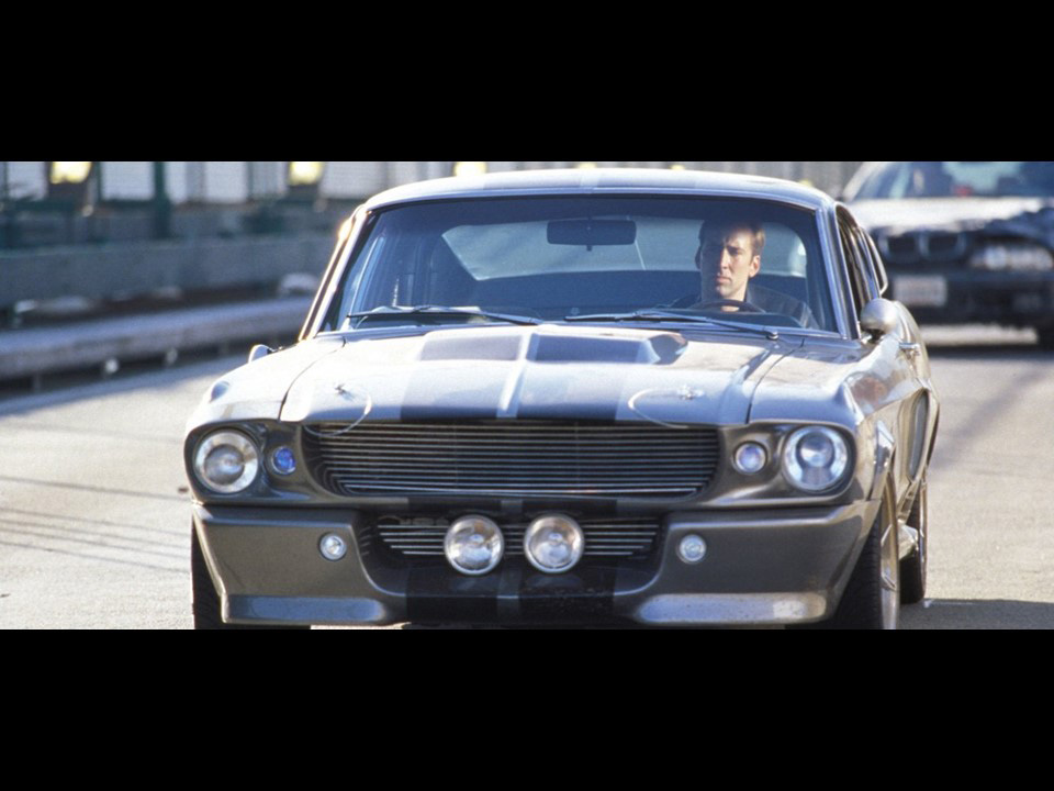
You gotta be gone in 60 seconds
That was the rule of master car thief Randall Raines. If he couldn’t steal a car in under 60 seconds, then he shouldnt attempt it or risk getting caught.
Speed is important in the digital workplace too. But, your users wont give you 60 seconds probably less than 10.
Getting pages to load quickly can be difficult it relies on so many factors:
- Computer performance
- Local network bandwidth
- Internet bandwidth
- Contention ration (how many people are using the connection)
- Server performance
- Server bandwidth
- Server location
- Apps running on server
- Calls to other services
- Efficiency of coding
And so on.
If youre having problems with reported speed issues, you need to get an understanding of each of these areas and the impact (if any) it is having on the performance.
We recently worked on a digital workplace project that had users connecting from China and they were having problems with speed. We narrowed the problem down to the relay time from the laptops of the Chinese based users to the server, and the additional delay in relay time to other services e.g. stock prices, weather, even Google font libraries.
We minimised the impact of these issues by changing a couple of things:
For Chinese users only (using targeting) we removed some dynamic blocks on the homepage, and replaced them with hardcoded links into that part of the site e.g. Blogs.
We also moved many of the assets regularly used on the site to a Content Delivery Network (CDN) this meant that these files would be delivered from local servers in China meaning less relay time and faster loading.
Essentially we removed some of the non-essential bells and whistles, but improved the User Experience because we fixed a more fundamental issue.
8. Did I say seven?
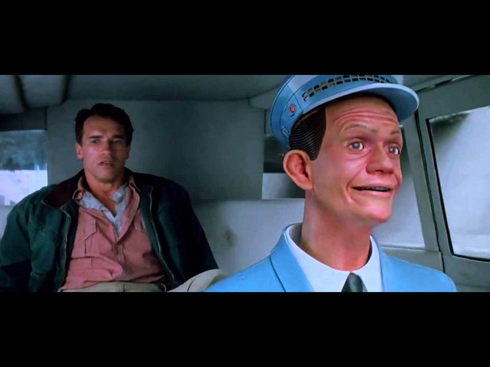
This is the Jonny Cab from Total Recall – the original starring Arnold Schwarzenegger where he goes on a virtual vacation to Mars, and then ends up going for real.
So, the Johnny Cab – along with a colony on Mars was a vision of the future from 1990. It was basically a self-driving car – that for some odd reason wasted half of the interior space in order to accommodate a spooky dummy as the human driver. Of course, the tech for driver less cars is here now minus the scary dummy, thankfully.
Were obviously still working on colonising Mars. But, another area where we have made progress is Artificial Intelligence (AI) and a subset of that Expert Systems. Expert systems can do things like diagnose diseases based on symptoms and DNA data, but they can also serve you business information typically via a chat bot.
Chat bots are starting to appear in the digital workplace. At the moment they are a bit rudimentary and sort of work like glorified search. But, the beauty is that they improve the more you use them they are built to learn based on inputs and reactions to the responses they provide. And they can be training to be more effective.
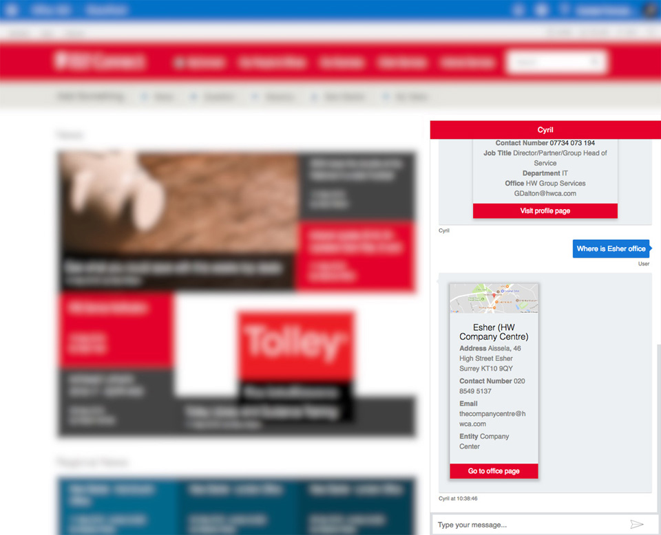
Here’s a chat bot that we implemented on a customer intranet its called Cyril. Its early days for this bot and it does things like give you information on people or offices or policies etc when you ask it in the chat window.
But I think what is most exciting about Chat Bots is when they are delivered via your regular messaging apps on your smartphone. That makes it super quick and super easy to interact with the bot and get information quickly when you are on the go.
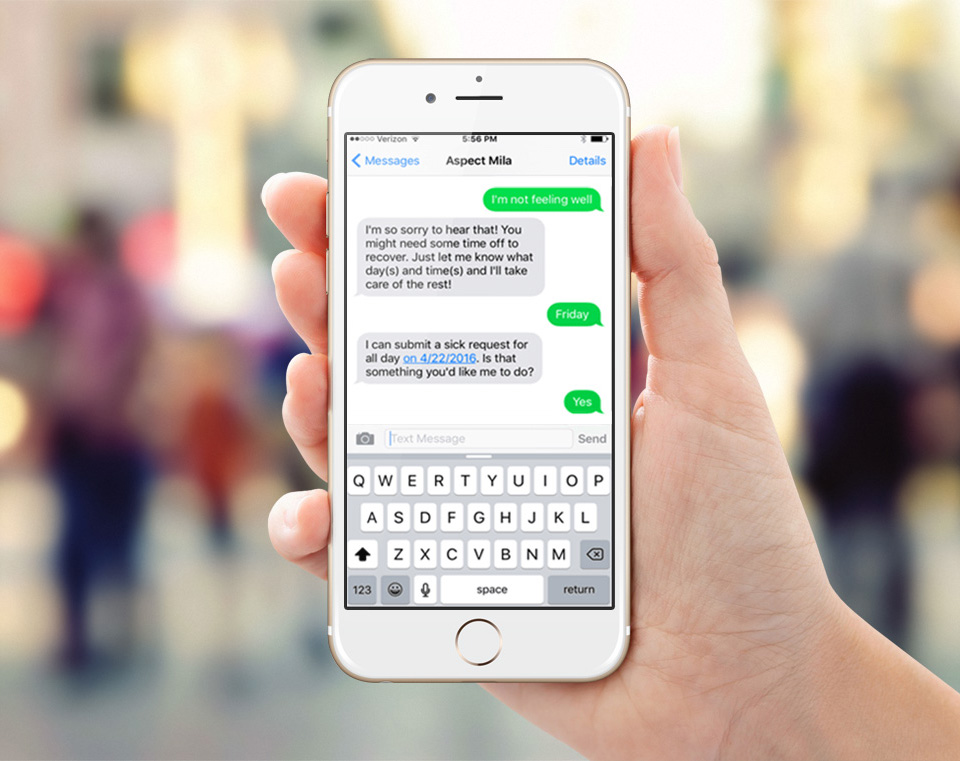
Were just about to enable access via Skype for Business on Cyril. So you wont need to open the chat window on the intranet anymore. We’re positive that this will deliver a delightful user experience to heavy mobile users.
Remember the pyramid
So, thats 7 ways you can deliver delightful user experience. Though, as weve discussed doing just one of them wont cut it. You need to build up your pyramid and you need to weave all of these things together to achieve Deep Delight. Thats the only way you can achieve a true, deep level, holistic sense of delight in not just one but all your users.