

 SharePoint Products
Beyond reading stuff, the web is about doing stuff, and people have similar expectations for your intranet. Even if youre not dealing with big data, youll have figures and facts to communicate, and interactive infographics can help you tell the story and express the meaning behind the numbers.
Text will always be crucial to your intranet, but here are six different approaches to communicating through figures, movement, colour and glyphs.
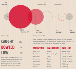 James Andersons cricket stats
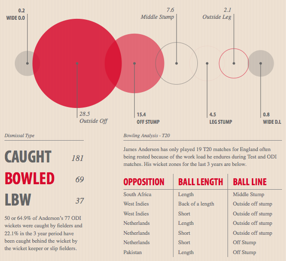
Sporting stats are available to everyone, yet its how they are presented that tells the story. James Andersons website opens with an interactive summary of his cricketing achievements; scroll down and hover your mouse cursor over elements of interest. Graphical in presentation, this is actually built with HTML, CSS, and javascript. Works well on desktop and tablet.
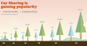 Future of car sharing

A sideways scrolling through time and countries, talking about the rise and usefulness of car-sharing. Works well on tablet and desktop.
 Inception Explained

Scroll down through the dream levels and see which character said and did what. Colours, movement, and text retell the Inception story, rather than stats and numbers. For desktop, not tablet.
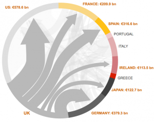 Eurozone debt who owes what to whom

Click on the countrys name or colour to see how much they owe, and to which other countries. This is a simple interactive graphic with a fact-panel to the right, courtesy of the BBC, based on readily available financial data. Works well on desktop and tablet.
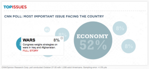 Infographical navigation

CNN presented key facts during the 2010 elections as stat bubbles to guide readers to relevant content. Its not clear that you have to click to bring up a little menu. You have to touch twice on a tablet.
 Six traditional infographics about the American political parties

Six categories to choose from; lots to read and digest. Each infographic could really stand alone. Works well on desktop and tablet (being six images), but to repeat, lots to read and digest.
A key usability issue on many of these sites is indicating what is clickable or more rightly what you should hover your mouse-cursor over.
While infogaphics and high-impact visuals continue to be popular and useful online, maybe more could be done internally to present narratives, stats, and facts in a visual and interactive manner.
Considering the effort involved, it may be wise to get design assistance from outside your team, and this seems worthwhile when you think about all the noise your internal communications compete with on your intranet. Catching peoples attention is the first hurdle communicating clearly is the second.
When you need to engage people in what might be considered dry topics, like a strategic shift or mandatory training material, plain text will not inspire people to get involved. Rich media is common online and the impact of doing something visually striking, and useful, within your intranet could priceless.