

 SharePoint Products
 Your website must support your overall business strategy, and you no doubt care about engagement, conversions (of some kind), and ultimately, sales.
Equally, your intranet must support your business strategy, and help employees get things done efficiently and effectively.
But your website, alongside your social channels, also supports your PR and reputation.
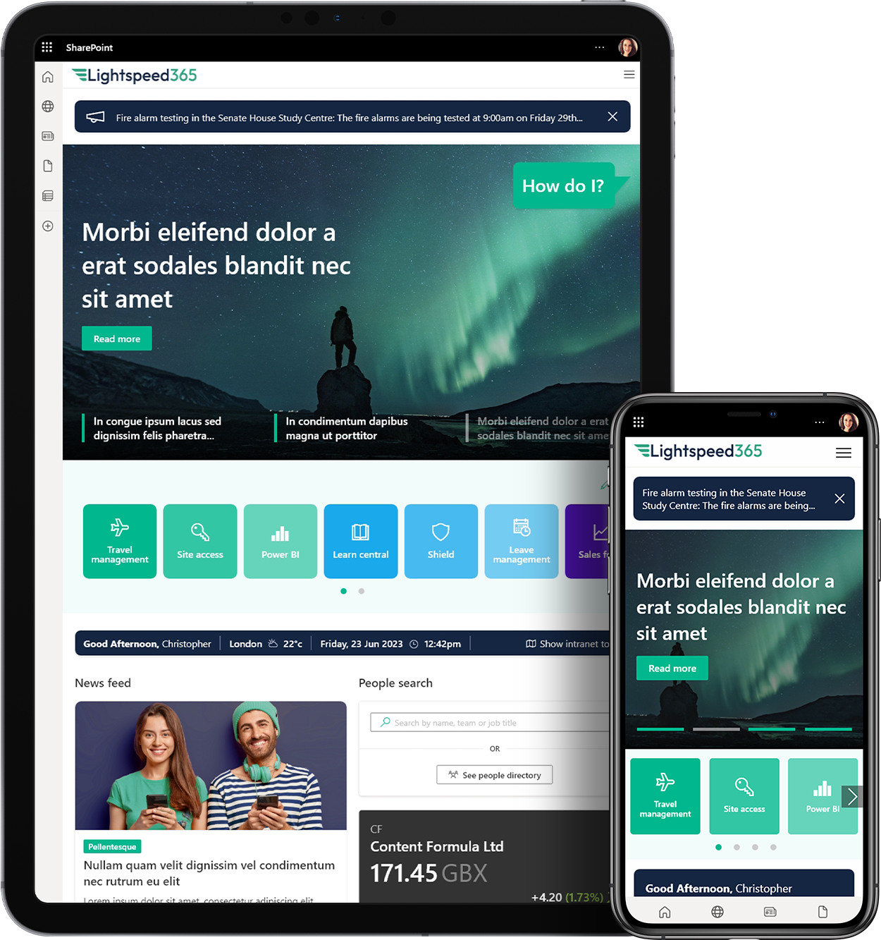
Hopefully, you and your stakeholders consider your online estate, of website and intranet, to be invaluable, but youre missing out if they do not work well on mobiles and tablets. If people cant use your website on smaller screens, they go elsewhere meaning your website is not as valuable as it could be. Further, the frustration caused to your mobile visitors could harm your reputation.
Employees with mobile access to a non-optimised intranet will struggle to complete tasks even tablets may offer a poor experience owing to the small navigation targets that can be hard to touch with a finger.
Yet it can be daunting to prove that moving to a mobile friendly design is worth the effort, and so heres exactly what to do go straight to your stats.
Step 1 compare the dwell time of visitors
Find the average length of time people spend on individual pages; this is sometimes called dwell time in conversation. Remember that very short visits are considered bounces and are of little value. When you compare time spent on your site by desktop users with time spent by mobile users, youll see a stark difference.
Google Analytics gives you the average session duration for desktop, mobile, and tablet users within the Audience > Mobile > Overview report.
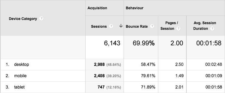
If your website is not optimised for mobile surfers, you might see that the average session duration for mobile is in the seconds basically, people bounce off your site when they realise its taking too long to load, or when they get frustrated with having to zoom in on tiny navigation.
In comparison, desktop dwell time should be in the minutes as people take the time to look around, and properly read your content.
A further column within the same Google Analytics report may tell you that people look at four or five pages on desktop, but only one or two on their mobile.
Yes, people have different priorities when using their mobile device to surf your site they may just want your location, or your latest blog article, but these things are still very much enhanced by a site design that is optimised for mobile and tablet use.
Employees have different priorities when using mobiles too often its about locations, phone numbers, and maybe approving documents and decisions. Optimising your intranet for mobile use isnt about making all the content available, its about making the right content and functions work well on smaller screens.
Step 2 make the case for mobile
The business case is clear. Now that youve done your three minutes of statistical research, you need only communicate what your company is missing out on.
X% of our web visitors use a mobile device, yet our website is not optimised for smaller screens and so performs poorly for these mobile visitors. Desktop visitors spend Y minutes on our site, giving them time to understand our offer, whereas mobile visitors spend around Z minutes on our site they reject our websites design and go elsewhere.
Desktop visitors tend to view V number of pages, and mobile visitors tend to view only W.
With these facts, we know we are missing an opportunity to engage certain potential clients, who expect a company like ours to be available to them any time, anywhere.
Optimising our website design for mobile use would capture this missed opportunity, and we would then see a marked increase in dwell time and page views, affording us greater chance to truly engage more potential clients.
If employees have mobile access to a non-optimised intranet, you could write a similarly concise business case based on your intranet stats. If employees do not have mobile / home access to the intranet at all then youll need to build a case for providing secure access and a mobile solution.
In five minutes, you can justify the move to a responsive web design or a mobile version of your online presence. The solution may take some time to implement, but once stakeholders agree that mobile must be part of your website strategy, momentum and budget will follow.
 SharePoint
 Office 365
 Teams
Teams Yammer
 Azure
Azure Power Automate
 Power BI
 LiveTiles
 LMS365