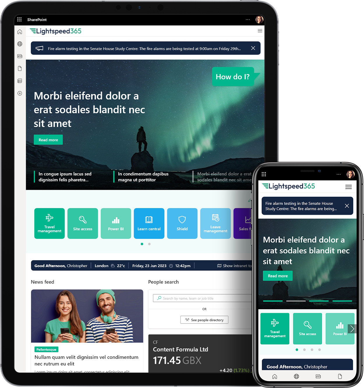
 Look at your home page from top to bottom. Lets consider what you can improve with about an hours work, with no need to seek approval from your steering committee. Assuming youre the site / intranet manager, that is!
Navigation menus
This might take an hour per item much longer if you mean to do a full, robust overhaul. To really get into menu design you should consider navigation to be separate from the structure / IA of your intranet. Menus are about helping people get around, whatever the structure. Card sorting and treejacking are basic, necessary (but insufficient) tools to help match your menus to peoples needs.
But before you start a big navigation project, why not simply review the terminology within your menus. Is everything clear and obvious, or is there a lot of jargon?
Note your observations about obtuse menu labels in about an hour, and then work with your UX and steering committee, and the indicated site owners, over the next fortnight to make improvements. Be sure to publish a news article or intranet blog to explain what youre doing (always keep people informed).
Headlines
Look at your home page. Are headlines too long? Many organisations aim for five or six words, or perhaps a certain character count. Do your headlines end-up on three lines, rather than one or two? The most important thing, in my opinion, is using unambiguous headlines. Headlines are not supposed to tickle peoples fancies; they are supposed to help a person decide what to read and what not to read.
Take ten minutes to note the headline length and clarity, then work with your internal communications team to set the guidelines to be succinct and clear.
Summaries
Directly below headlines you should offer a sentence, just a few words, to express the what and who of the article. Its all about helping people work out if the article is relevant to them.
Are summaries written with the home page in mind, or are they just the first sentence from the article? Take ten minutes to assess the clarity of summaries, and then work with the internal communications team to set the guidelines for bespoke summaries.
Photos / images
Does your home page look the same as it did a fortnight ago? Fresh, relevant images for each main article can help communicate that your intranet is a vibrant, up-to-date place. Images need to be relevant take care using stock photos. Try to use snaps taken with peoples smartphones whenever you can. Set standard dimensions for a pleasing, consistent page layout.
Text
This is a big one, as it can have implications for design / layout across your site / intranet. But the principles can be reviewed and set in less than an hour, so get your UX pro and IT people talking about:
- Font-family is it readable on different resolution screens? Is each letterform clear, or might you choose a different font-family?
- Text size increase the text size a bit. It helps everyone. Dont let your chief designer tell you that people can increase the font-size themselves using their browser because people dont know about this browser feature and dont do it even when they do.
- Line-height increase the space between lines of text (called leading in the print world). This will dramatically increase readability, understanding, and instantly makes your pages look clear and designer-y. It just does!
- Paragraphs maybe increase the whitespace between paragraphs a smidge. Again, it increases readability. Talk to internal comms team members and content authors about ideal sentence length and ideal paragraph size. Generally, we need more paragraph breaks!
Navigation aids
When a person is at the bottom or a page, or end of an article, what do they have to do? Are they forced to scroll all the way back to the top to navigate away?
Place a Back to top link in the footer / at the bottom of every page. An hours work for immediate benefit! Just do it.
What other in-page links or navigation aids might your colleagues expect? Review famous websites and reflect on how they help you get around.
Logo
Make sure your company / intranet logo (or name) is clickable and takes you directly to the home page. You may need to get IT involved if you cant hack the code yourself. This is about creating a consistent and trustworthy way for anyone anywhere to jump to the home page. Its expected behaviour (because external websites all do this) so it should happen on your intranet. Might take you ten minutes, and needs no approval just do it!
Search box
Make sure your search box meets peoples expectations it should be in the upper-right of your pages, and:
- Use a simple magnifying glass icon.
- Have an open text box to type in (i.e. not just the magnifying glass).
- Ensure the input is submitted by clicking the magnifying glass icon as well as hitting the Enter key on ones keyboard. Let people do what they prefer.
- Consider assigning a keyboard shortcut so that people can jump to the search box and simply start typing. Keyboard shortcuts can enhance the accessibility of your intranet.
- Consider making the search box hold the cursor be default in other words, as the page loads, the cursor is already in the search box.
- No need to place the word Search in grey text within the search box people should be familiar with your intranet and what else could the box be? Ensure the search icon is clear, and that you use semantic mark-up in the code to label the search as search.
Youll probably need ITs help, and you may have an experienced UX professional on hand to guide you. But otherwise this is a global improvement you can just get on with.
Footer
I bet you get a lot of requests for new links to be popped into your main global navigation. This is a big deal because you have to be strategic about global navigation, yet its hard to say no to the H&S director.
Consider developing a fat footer place secondary links and helpful links in the global footer. Nobody will use it very often, but the links are always there when a need arises. A fat footer can be developed over time to be beautiful and useful, but can start with a dozen not-very-important but needed links, grouped by category.
Just do it
These nine intranet ideas might take you seven to fifteen hours to assess, implement, and test. Thats not a lot of time for quite a lot of value. Remember to consider the governance of your intranet for continuous improvement purposes, and keep contributors and end-users informed.
What else can you improve about your intranet in an hour?


 SharePoint Products

