Building a usable intranet on SharePoint is easier than ever before owing to Office 365 in the cloud. Microsofts cloud subscription model has made the power of SharePoint available to organisations that previously would not have had the IT support necessary to deploy such enterprise level software.
But organisations of every size have to consider the user experience that out-of-the box SharePoint offers, and theres a problem: people cant get home.
 How do you feel about the hamburger icon that you might notice when using a mobile site? When I first started seeing this web furniture I was happy to touch it to explore, and not unexpectedly, there was a menu. These days, Im happy to see the hamburger menu, and ignore it, until I want to explore the site. Do you feel the same?
But if youre keeping up with design trends and user research, you might know that the hamburger menu does not appear inviting to everyone. Many people do not notice the icon, cannot interpret the three horizontal lines, and do not ever touch it.
User research shows hiding menu items means they dont get used
Ive been conducting rough and ready user testing in recent weeks, looking into how people think and feel about their Office 365 intranet. One striking finding that I cant ignore is how difficult people find returning to the home page is.
Many people, it seems from my research, like to start a fresh task from the home page; but getting back to the home page from wherever they are within the Microsoft cloud is a challenge.
Microsofts cloud SharePoint offering expects everyone to think in an app way OneDrive is an app; Delve is an app; Word is now an app all accessible from the main waffle icon.
How many homes are there?
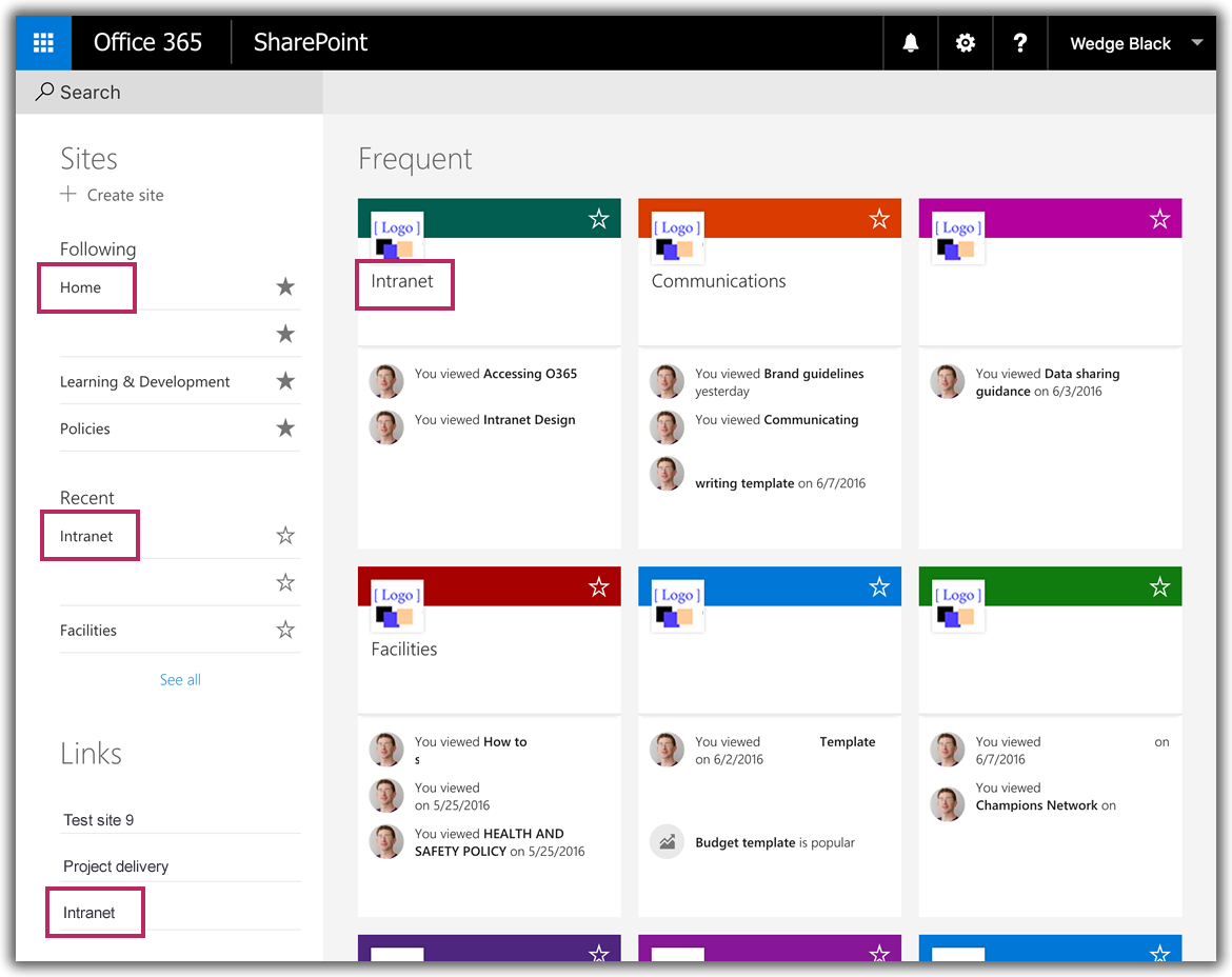
Think about how people access the home page of the intranet. From log-in, a person might land on your intranet home page or, depending how they logged in, the Office Home page.
From here, they have to click on SharePoint. This brings up SharePoint home. This is perfect if you want to dive into your teams collaboration site, but it isnt the intranet home page that comms people might expect.
(SharePoint was named Sites up until June 2016.)
To reach the true intranet home page, the person has to click on a link or the tile / card called Intranet (highlighted above). Now they get to experience the company home page (but in a new tab)
Once deep within the intranet, people can click the company logo to get to the home page (if they know this trick) but what if they are in an app?
Imagine youve just performed a people search and have found Vikrams phone number and maybe office location. Now, you may well be inside Delve now looking at Vikrams Delve profile. Its likely that all the intranet-specific menu items are not shown, as this is just Delve. How do you return to the home page? The back button on your browser should work (unless you’re in a new tab), but do you really want to click that 12 times, each time checking to see where you are?
How do you quickly get from Delve to your intranets home page? Theres no logo to click.
Theres left-hand menu item that just says Home but this is Delves home. Take a look at some research results, below.
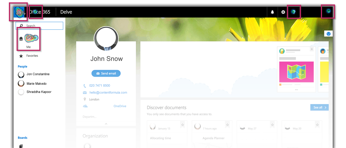
Half of my research was conducted during usability testing with me sat right there with the person, but the above heatmap shows online testing where the person worked alone.
![]() You can see that, when a person is in Delve and they need to return to the home page of the intranet, only 39% first think of clicking the waffle icon. The majority of people click the Home link and why not? It has a house icon and everything! But this is Delve home.
You can see that, when a person is in Delve and they need to return to the home page of the intranet, only 39% first think of clicking the waffle icon. The majority of people click the Home link and why not? It has a house icon and everything! But this is Delve home.
The answer is supposed to be the waffle icon click the waffle and the paddle menu offers you SharePoint. Youre supposed to know what this word means…
While every day users of the Office 365 environment may well become confident in getting around, those people new to the platform, or just those who only use the intranet every so often, do not find the basic navigation intuitive.
The waffle icon offers a paddle menu of coloured square icons (the ‘app launcher’) including something called SharePoint, which takes you to to master index page that lists out all the intranet and project sites you personally have subscribed to or have access to. This is not an intuitive page (although its very useful); most people expect the real intranet to guide them around.
Next to the waffle icon is a big menu item that just says Office 365. If you click this, you land on a page that offers you the exact same coloured square icons that the waffle icon offers. Because this is the Office 365 home, not your intranet home.
Click on SharePoint and you land on an index page, offering you all the sites you have access to. From here, youre supposed to know to click on Intranet or whatever your company has called the intranet. Only now do you reach the home page.
So from doing a people search (a very common task) it takes three clicks to get to the home page, rather than one. The hardest click is the first one; very few people Ive worked with ever explore the waffle icon. It does not indicate that its a button or that its hiding a menu.
This seems awkward, and the people Ive been working with felt that they were not experienced enough to understand the intranet. They graciously excused the intranet and said they needed more training. This is horrible, when the intranet has failed them, and made them feel lost and frustrated.
Help people get home with a custom icon
![]()
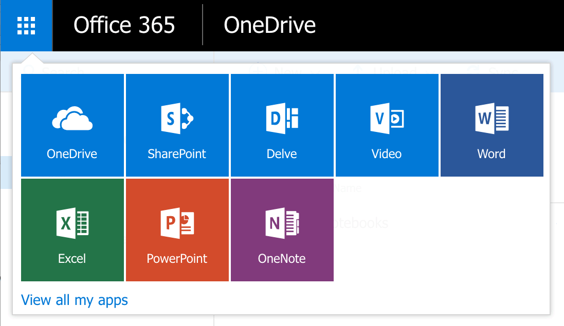
You (your intranet administrator) can add a custom tile (app icon) to the paddle menu found within the waffle icon.
So you could add an icon for the home page of your intranet, reducing confusion and the number of clicks needed to get home when a person finds themselves in Delve or some other app.
But, and its a big but, your new icon only shows up on the My apps page (where a person lands if they click View all my apps in the paddle menu) until each individual chooses to add it to the paddle menu by hand. In other words, every employee needs to visit the My apps page and select the new Intranet icon and use the Pin to app launcher function. Is this something everyone will do? No.
The take aways
- Dont expect people know whats in the waffle icon, or even realise it is clickable.
- Understand that home can mean different things to different people; Search has a home; Delve has a home; Office 365 has a home; SharePoint has a home.
- Tell people that things often open in new tabs – help people be aware of what their browser does.
- Introduce the waffle icon to people as part of your adoption and engagement activities. Highlight it in training. Explain how to reach the home page of the intranet, and how to reach other SharePoint sites.
- Consider beatifying your intranet with a brand design that suits your company, and that adds rich navigation features (like better, more obvious menus). Such brand designs do not affect the SharePoint code and are easy to install.
Its this last item that needs careful consideration. While many smaller organisations are happy with the vanilla look of out-of-the-box SharePoint, medium and large companies almost always talk to us about a suitable design for their brand. Some people have concerns about customising SharePoint, but adding an attractive design isnt customisation, its merely design.
Joe explains how easy it is to brand SharePoint, even in the cloud take a look. A good brand design doesnt just make your intranet look more pleasing, it can help with the usability and UX adding much needed navigation aids and helping people do what the most want to do go home!